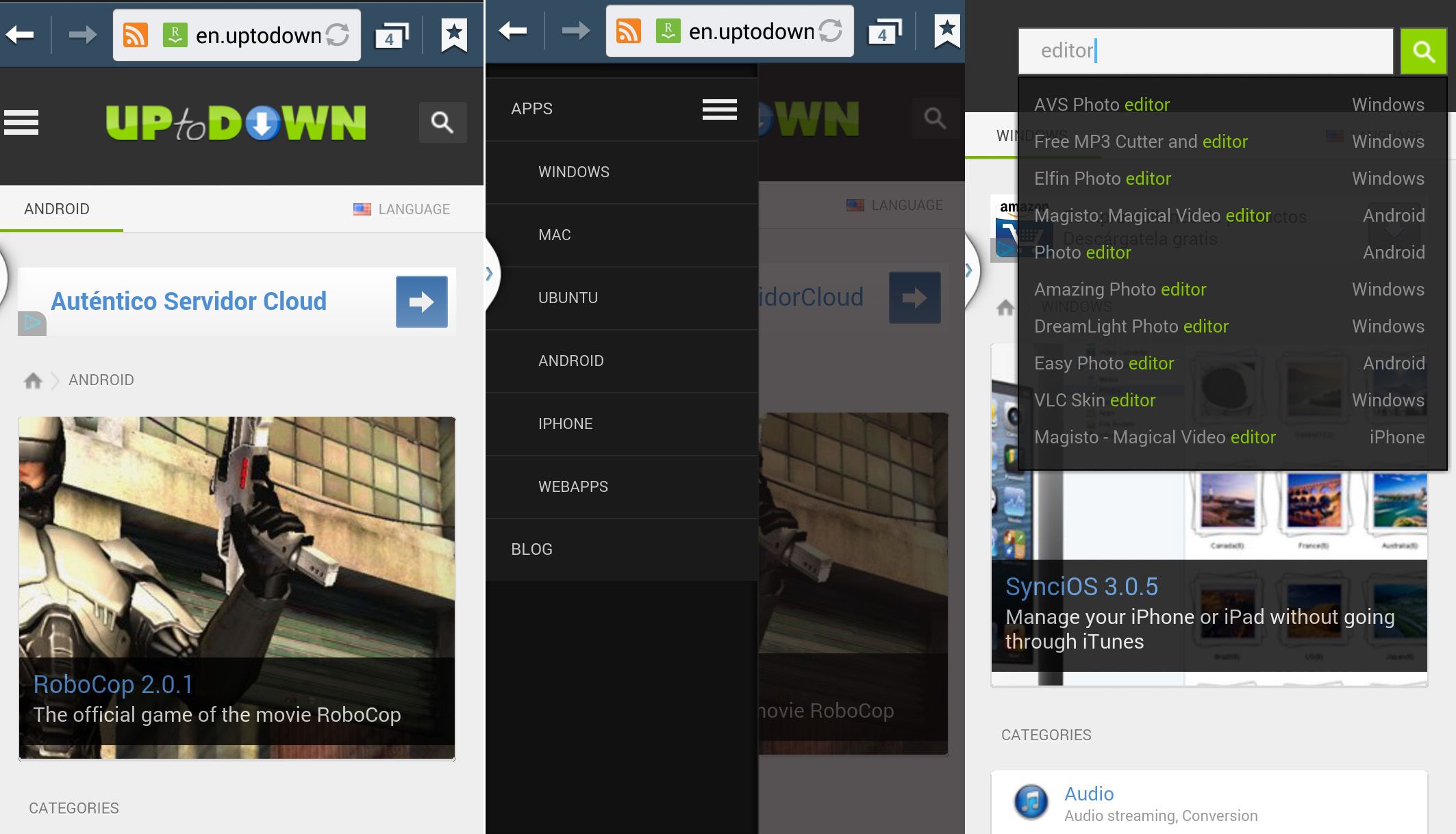
When the market demands change, changes must be made. The project that we launched a few months ago to make browsing on Uptodown on smartphones and tablets as comfortable as possible is moving forward. We’ve improved the user experience on touchscreens, added a new browsing menu, and adapted the interface for low resolutions.
The latest changes in the responsive page design allow you to adapt the browsing experience to the device you’re browsing from. Thus, for resolutions lower than 400 pixels in width you’ll see a new drop-down menu from which we can access the different sections of the site, both the download sections for the different platforms and the Uptodown blog itself.
Furthermore, the program search bar with the autocomplete tab in the top part of the screen is now also available in resolutions down to 320 pixels, meaning you’ll have practically all the web features also available from your smartphone just by accessing the site, whether directly from your browser or through our official Android app.

Touchscreen browser has also been improved, with the shortcuts adapted to make them more comfortable, so that the clickable surfaces are now much bigger, with a pointer icon that shows you where you can click. Both this feature and the responsive design modifications can be seen in the next video.
We’ve also made changes at the performance level, with the page loading speed enormously optimized, with the download on mobile devices being much faster since data consumption has been massively reduced.


