Google is still unrelenting in its mission to unify the look of all of its products. For the company, it’s essential to make it as easy as possible to use each app with a design that’s becoming more and more common. It’s now come time for Gmail to become the latest app with a new interface that reflects the ‘Material Theme,’ a much more attractive look that’s similar to the one seen in the desktop version.

Gmail will update to ‘Material Theme’ to renew its image
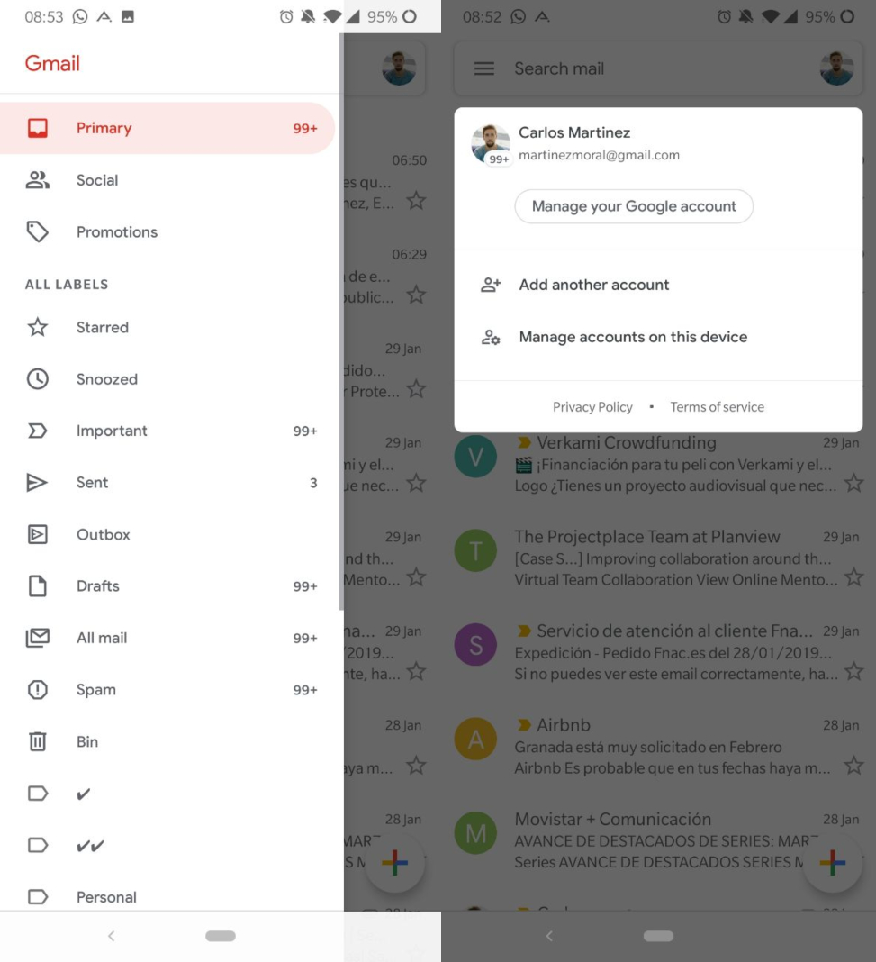
Nikolus Ray, Google product manager, has been in charge of announcing the design change in the version 9.1.13 available on Uptodown. This way, the app will be more unified with the G Suite service. The interface evolves and at a glance, it’s clear to see color white is what predominates over the rest of the visual elements.

Along with the ‘Material Theme,’ they’ve added new features like the possibility to quickly see photos or videos without having to download them and to switch between your personal and business accounts in seconds. Gmail also shows any emails that it considers to be dangerous in red.
New year, new look. Learn more about our updated design, including features to quickly view attachments and easily switch between personal and work accounts → https://t.co/bt10EUVutd pic.twitter.com/nR2d7DQ8cx
— Gmail (@gmail) January 29, 2019
So what exactly is Material Design?
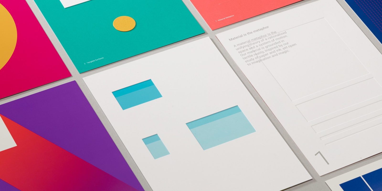
To understand the design change that Google is going to make to Gmail, it’s helpful to analyze what Material Design is all about. This design philosophy is the evolution of Flat Design (used by Apple) and gets its name from the fact that it’s based on material objects.

As the years go on, Android and Google have embraced this style and now Gmail is the latest app to take on the design in its mobile version. Through the Material Theme that the the email client is adopting, you’ll enjoy an interface that focuses its visuals on the interaction between lights and shadows. In other words, you’ll feel like you’re entering into the structure due to the movement, the position, and the gradation of the boxes and buttons.


