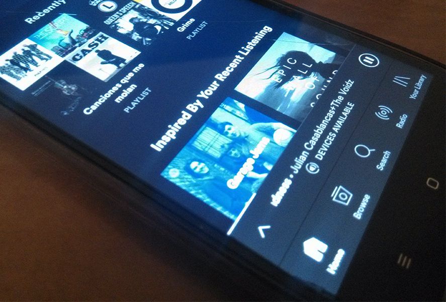
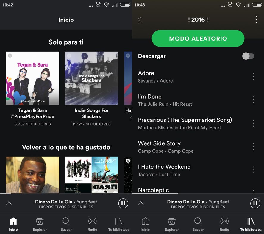
One of my standard routines when I leave the house is to put on my bike helmet, grab my smartphone, and tap the Spotify icon. That’s why when I opened it up today to see a new interface I was surprised. Spotify doesn’t particularly stand out for its UI design on Android: it’s fine but it’s a bit boring. But we don’t have to worry about that much longer as it’s just undergone a rather large facelift: now it has a navigation bar at the bottom of the screen.

This bottom navigation bar is a huge draw on lots of different apps. We recently pointed out how AirDroid has added one, and now it’s Spotify that’s jumped on the bandwagon. Material Design is getting ever more fans – which makes sense given that this change enormously improves your interaction with the app. Finding new Start, Explore, Search, Radio, and My Library buttons at the bottom of my screen was a great joy. The greater accessibility and intuitiveness produced by this small change is priceless.
This change massively improves the lives of people who use devices with large screens. The old menu based on drop-down menus from the top left corner wasn’t terribly useful. It required too many taps on different menus to do simple things that are now perfectly accessible from the bottom bar. That said, this addition has left the settings menu a bit hidden. If you want to access it, you have to go into your library and then at the top right you’ll find the settings icon.

Recently we told you about a bunch of tricks to improve your Spotify user experience and now it’s the app itself that has changed for the better. This interface update arrived even without a change of version. If for some reason you still don’t see it, just restart Spotify so you can enjoy this little big upgrade.
Spotify for Android on Uptodown [APK] | Download


تحياتي