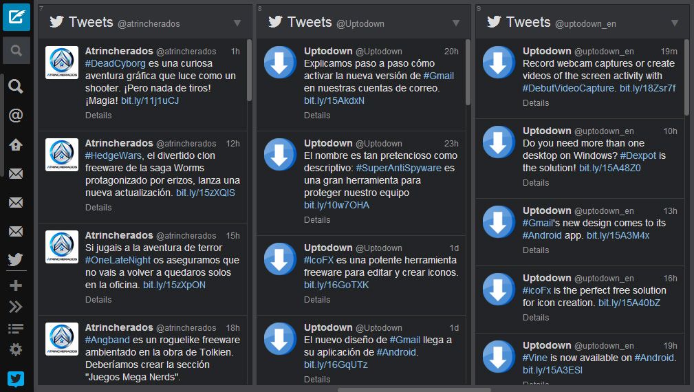
After Tweetdeck was purchased by Twitter, and then went on to shut down its services for both smartphones and the desktop program, many people decided to change to another one of the many available alternative services. Even still, Tweetdeck hasn’t been left to fend for itself – it has just been updated with a completely new redesign of the interface, in addition to improvements in stability and performance for the Chrome and browser versions.

The visual changes are clearly noticeable when you login. They have gone with simpler lines, and flatter colors. The other big feature is the addition of a new navigation bar to the left which substitutes the one you had been using previously. It allows you to view expandable information on the different options, both about active columns and the rest of the utilities on the service, such as search, settings, and the publish button.
It is now easier to browse among the different columns you have displayed because you can easily bring one of them into view by clicking the corresponding icon on the vertical menu bar, which is a total win for those that manage several twitter accounts simultaneously and have to battle with about a dozen different columns.
Download Tweetdeck for Chrome | http://tweetdeck.en.uptodown.com/webapps
Official website | http://tweetdeck.com/


