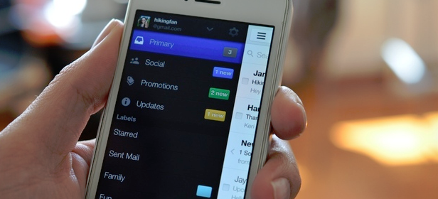
After giving Google+, its social network, a makeover, and unifying its chat services with Hangouts, Google has announced what we were already expecting, that Gmail is going to be redesigned to better adapt to the times to help with the enormous amount of notification emails you get in your inbox. It was first available a few days ago for many users, and it will be rolled out for everyone throughout this week.

The biggest change is also the most obvious – the new tabs. Google decided that the best thing to do is organize all the content that comes to your inbox by type, which is obvious. The system is automatic, in a way, as once a sender is assigned to a tab, those emails will always appear there. This allows you to organize your inbox into different subfolders for your primary emails, promotions and offers, another for newsletters, and another for updates from social networks, so you can visually distinguish them more clearly.
A small change has also been made to its appearance, which has more colors and leaves the monotonous white and gray color scheme behind (which you could always have changed for a skin, of course). Additionally, it has made integration with Google+ even easier as users can that receive notifications about comments and +1’s on their timeline can respond automatically from Gmail.
This Gmail renovation will also come to the mobile app, first on Android, then on iOS, and will be similar to the desktop version. It will have tabs, which can be personalized, and you will be able to respond to Google+ notifications without having to open up the social network.
Google is very cautious when it comes to messing with Gmail, and the changes tend to be more aesthetic or organizational than profound modifications. This one is sort of in between the two, with some exciting changes to organization and features in general, but time will tell if they are put to use well, or, like its previous attempts to organize content into different sections, they will live a short life.
Download Gmail on Android | http://gmail.en.uptodown.com/android
Download Gmail on iOS | http://gmail.en.uptodown.com/iphone


[…] Gmail’s all-new design, which rolled out last week on the desktop version, is appearing for the first time on Android devices today with a graphic interface more in line with that of Google+, and many other similar changes with the objective of making the email service more intuitive and efficient, such as the new tabbing feature, the notification settings by label, and the new lateral menu. […]
[…] Google recently released a new version of Gmail with various new features for managing your inbox, in addition to some changes to the interface. Although it is now available for everyone, you have to activate the update manually. Here we explain how to do it step by step. […]