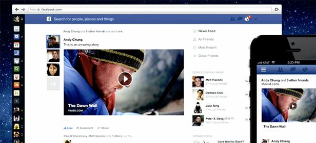
To suggest redesigning a service such as Facebook, which is visited by practically every person connected to the Internet, must present an enormous problem. However, just as they showed a couple days ago in their press conference, they seem to have everything worked out in regards to the changes they will soon introduce to the main menu and notifications.

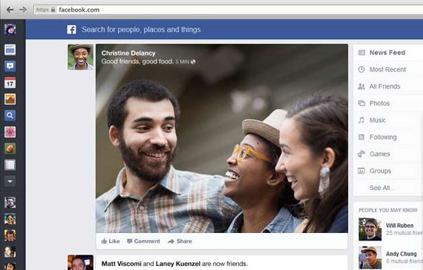
Once the new design is applied, which you can temporarily try out by signing up for the waiting list, the first thing you will see when you open up to the renovated interface, similar to the current mobile applications, is a lateral menu with icons on the left and more space for notifications. This change is aimed towards creating not just a more common design among all the platforms, which helps to secure the platform’s identity, but also to make your timeline bigger and clearer.
Photos and videos are much bigger. It is a new way to share content and make it more attractive, allowing you to better organize your albums, and making it easier to watch videos. Also, you can filter and organize all the content into separate groups according to your personal tastes. What you end up with is a much cleaner and clearer interface, something that is also very popular among modern designs. That “Goodbye to clutter” phrase with which they’re announcing the change isn’t casual.

Facebook’s ultimate goal is to get users to spend more time online. Bearing in mind that the amount of time that users spend chatting and viewing photos on the web is enormous, this new push is clearly for commercial purposes, especially when you realize that it is the main page that contains all the advertising.
Currently, access to the new design is limited to small groups because it is still in its beta phase. However, throughout the next few weeks they will open it up to new users until it is accessible to everyone.
Download Facebook on Uptodown
Version for iOS | http://facebook.en.uptodown.com/iphone
Version for Android | http://facebook.en.uptodown.com/android


[…] more common to receive blog updates on Facebook, Twitter, or other methods. The former has recently updated its design to make it more simple and visually appealing, while the latter is a quick and efficient utility […]