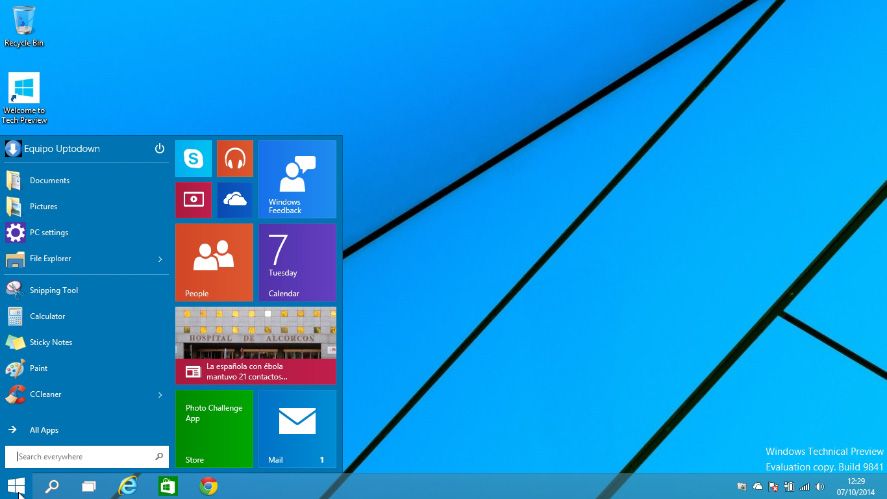
The center of the experience on Microsoft operating systems has always been the Start menu and its default position in the lower left corner of the desktop. This design pattern has been in place since Windows 95, meaning we’re talking about 19 years in which any conceptual break has ended in either catastrophe or correction. And that brings us up to the present, in which Windows 10 has recently appeared on the horizon promising the return of the traditional Start menu, to the detriment of the Metro desktop.
The other day we looked at how to install the preview version of the operating system with the beta of Windows 10 Technical Preview, which turns out to be fully functional and surprisingly stable and fluid even on machines where Windows 8.1 ran rather poorly. Amazing how something as simple as going directly to the comfortable desktop, pressing the WIN key, and finding yourself inside the unfailingly robust Start menu can signify the return of a forgotten confidence in a long-familiar product.

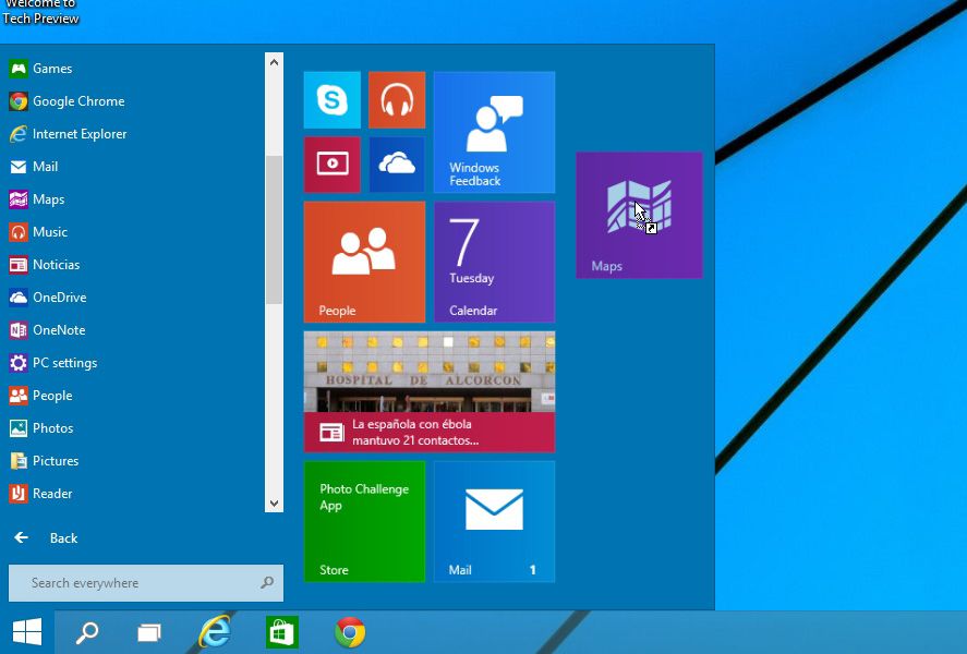
Microsoft has at least managed to make use of its accumulated knowledge when it comes to ‘understanding’ the ModernUI desktop and its Live Tiles, which share space with the sequential list of shortcuts to the left. If you move your mouse to the border of the screen you can resize it as if it were a normal window, and you can customize your workspace around the tiles and expand it to suit your needs. In fact, by dragging Metro applications (or traditional programs) to that space you can integrate them alongside the rest, and can also modify their size by right-clicking on any of them.

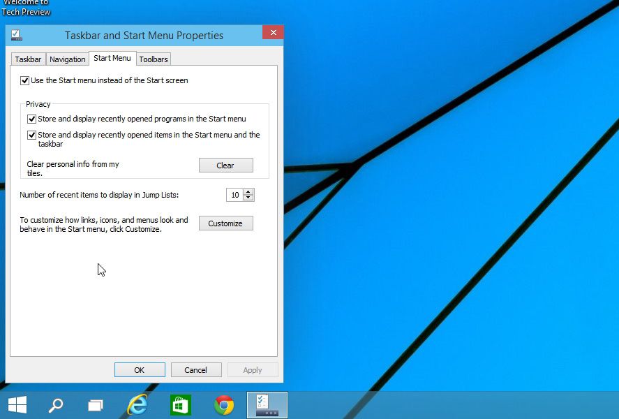
That said, covetous human bastards that we are, we always want what we don’t have, and there might be people out there mourning the impending loss of the bi-desktop of Windows 8. Never fear, because if you right-click on any space in your open Start menu and then go to Taskbar and Start Menu Properties > Start Menu you can bring back the Metro Start screen by unticking the option Use the Start menu instead of the Start screen.

For everything else, life has returned to its proper course, and apart from a few light modifications, the Start menu is back along the lines of its condition in Windows 7, by default offering a list of commonly used programs and above them shortcuts to any user folders or programs you want to pin by dragging and dropping them there. If you go to All Apps you’ll see a list of all your installed programs and apps from Windows Store, downplaying the file-tree structure that brought us so much joy in the past to offer all your local content in a jumble. Smart searches are the future. In theory.
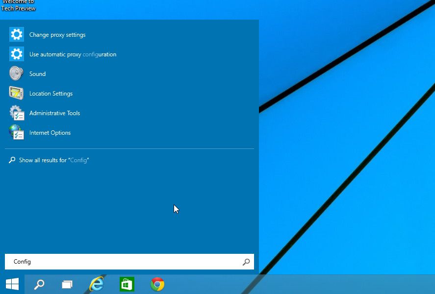
The context search that came along with Metro has also now been integrated into the desktop, so that by pressing the WIN key and typing your search term you’ll receive all your results instantly. What’s still not clear is the difference between the global search button and the magnifying glass button alongside it. We suppose that will be the location of Cortana, the voice assistant with which Microsoft aims to compete with Google Now and Siri.

It’s not insignificant that practically all the new features on Windows 10 focus on the Start menu. Beyond the new features we saw earlier, such as the multidesktop system or adaptable windows, the real essence of the Windows experience lies and should lie for many years in the Start menu, at least for desktop computers. You don’t have to be a rocket scientist to see what this means for the brand and the symbol of identity it provides.


GOOD