As you probably know, parents or grandparents with smartphones can be dangerous to your health. WhatsApp messages with hundreds of emoticons in a row or 24/7 technical consultations are some of the potential consequences of suddenly supplying an entire technological micro-universe to users unaccustomed to using smartphones. To ease this transition it might be a good idea to use Wiser, a minimalist launcher focused specifically on people being introduced for the first time to the world of smartphones.
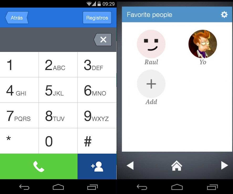
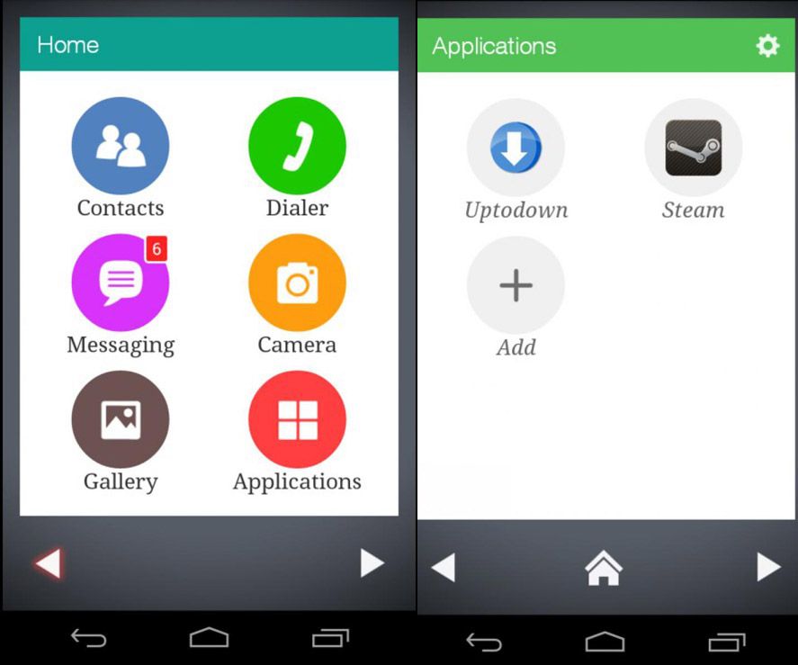
Like the other launchers we’ve talked about here on Uptodown, Wiser aims for simplicity and clarity when it comes to displaying the main options that any low-intensity user turns to most often. Thus, the main menu is divided into six main options: contacts, phone, messages, camera, gallery, and applications. By clicking on the lower horizontal arrows you’ll access other desktops, one to display up to six favorite contacts, another for notifications, and additionally create other shortcuts to any installed app.

The truly interesting thing is that each of these sections is at the same time simplified with only the most essential navigation options: if you go to the phone section you’ll have your dialpad with very large buttons, and in the call log button you’ll see the latest received and outgoing calls, also in a straightforward and direct interface. The fewer flourishes the better.
That’s not the only simplified section. Each contact also has a display card with its basic data divided into three tabs: one to display the telephone number and a button each to call or send messages with your default messaging tool, another with the alternative phone number if they have both a landline and mobile, and a third for their email address.

Even still, it’s possible to access the rest of the apps installed on the device or any device configuration options in ‘Settings’, where you can hide any confusing or unnecessary options on the main desktop to avoid overwhelming the user with too many choices. A clear and concise system of menu, straightforward navigation, and an array of minimalist options. Exactly, in fact, what many are looking for on a mobile device: simplicity.


