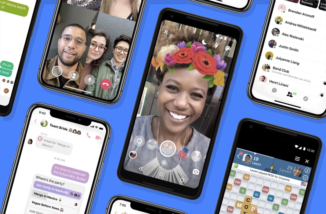
Facebook Messenger has a completely new design. Over the years, the messaging tool has become more and more overloaded, which is why the Zuckerberg emporium has decided to pull the brakes and rethink the structure of the official client for Android and iOS. The Messenger 4 update seems to have finally listened to its critics, following a recent study that showed 71% of those surveyed value simplicity of the app over any other feature. Now the app will be much less cluttered and way easier to use.

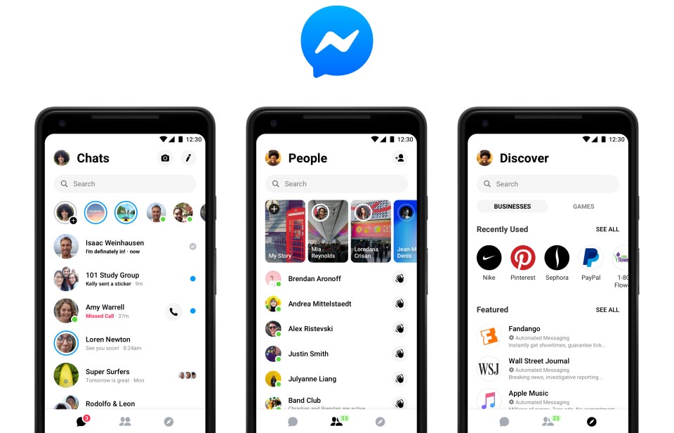
The app will now concentrate all its content into only three tabs. The Chats tab is pretty self-explanatory while in the People tab, you’ll see all your contacts along with their Stories, and in the Discover tab, you’ll find recommendations based on its algorithm, connecting you with external services like Instant Games and business pages.

In addition to the interface makeover, they’ve also added a small customization layer for your conversations, letting you associate a specific color for the chat bubbles for specific contacts. Plus, this seems to be just the beginning of a series of upcoming changes, and that will include, among other things, a new dark mode for the app.
Although this new interface is already integrated in the official app, the change will gradually be phased in for users over the next few days. So if you don’t have it yet, you’ll just have to be patient and have the latest version of the client installed for Android.
Facebook Messenger for Android on Uptodown [APK] | Download


nyamka
I used to be able to choose ANY of the emojis within iOS to comment on messages within Facebook Messenger send to me …. now I‘m back to only being able to choose between the original 7 ones …how on Earth is that an improvement!?!?!?!?