eBay was in urgent need of a facelift. The leading global online auction platform now has 157 million currently active users and 20 years behind it, which is a long enough time for consumer habits to change completely, starting with the platform from which it operates. It was high time to give its official app a shakeup, and now version 4.0 of eBay for Android and iOS has duly been released with a complete revamp and lots of new features for buying, selling, and tracking your auction items.
In the face of extremely simple apps like Wallapop where you can add an item to sell in a matter of seconds (although this secondhand sales app falls into a different league entirely), eBay clearly was missing a level of accessibility for many users. This update fills that gap, offering quick, agile browsing that makes it straighforward to follow or bid on an item or analyze stats on things you’ve put on sale.

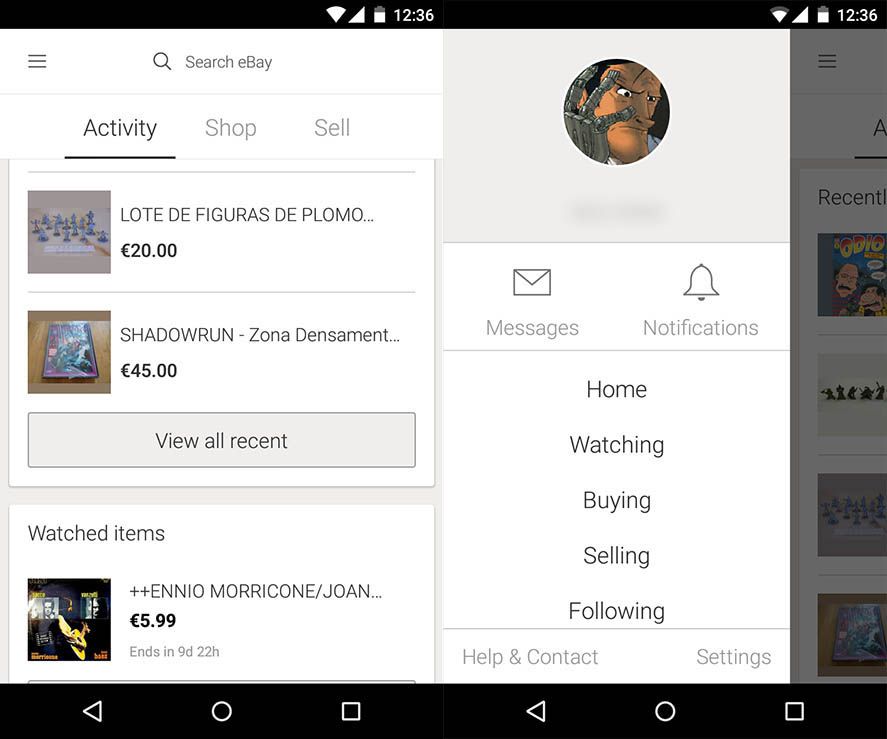
When you open the app you’ll see straightaway how simply everything is organized into three sections: Activity, Buy, and Sell, alongside your personal control panel accessible from a pullout sidebar.
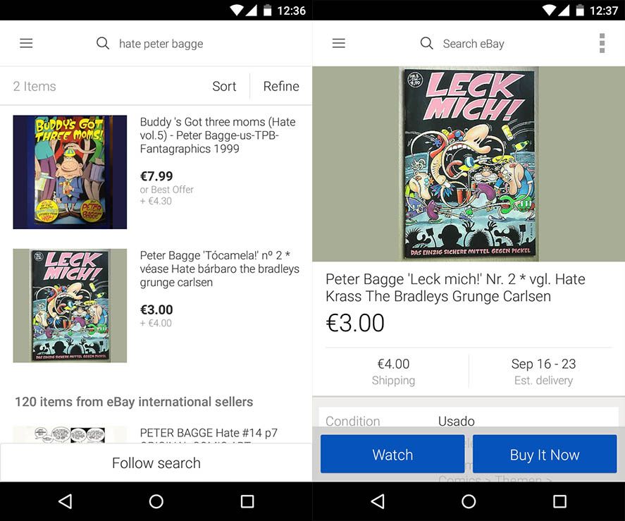
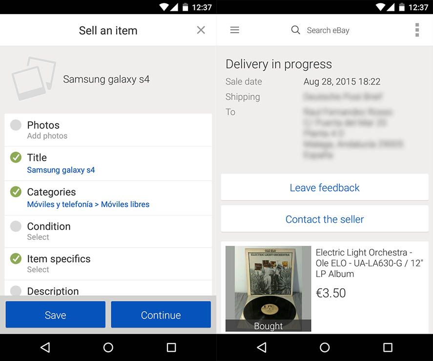
When you access an item’s page you’ll have a tab at the bottom with buttons to either follow or sell, as well as a clear display of all the item’s information. This ease of use can be noted particularly in the other section, for selling, where posting an item for auction is much faster now thanks to the wizard that lets you create your post based on an already-published one, saving you from having to fill in the category info.

It’s cliché to say the experience is now much ‘more organic’, but the new changes do mesh perfectly. If you’re viewing a product you’ll see an option on its page to create a listing using that post as a reference. Viewing the seller’s page or following a specific search is a matter of a couple taps on the screen. The cleanness and coherence of the interface has made it so the eBay experience on mobile devices is finally equal to the browser experience on desktop computers.

Source | Official eBay blog


