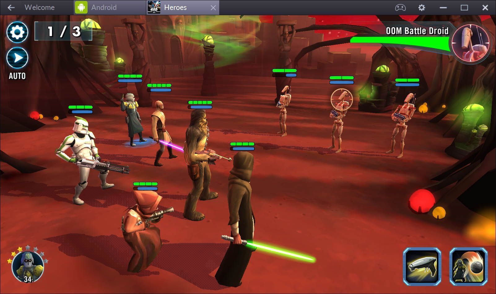
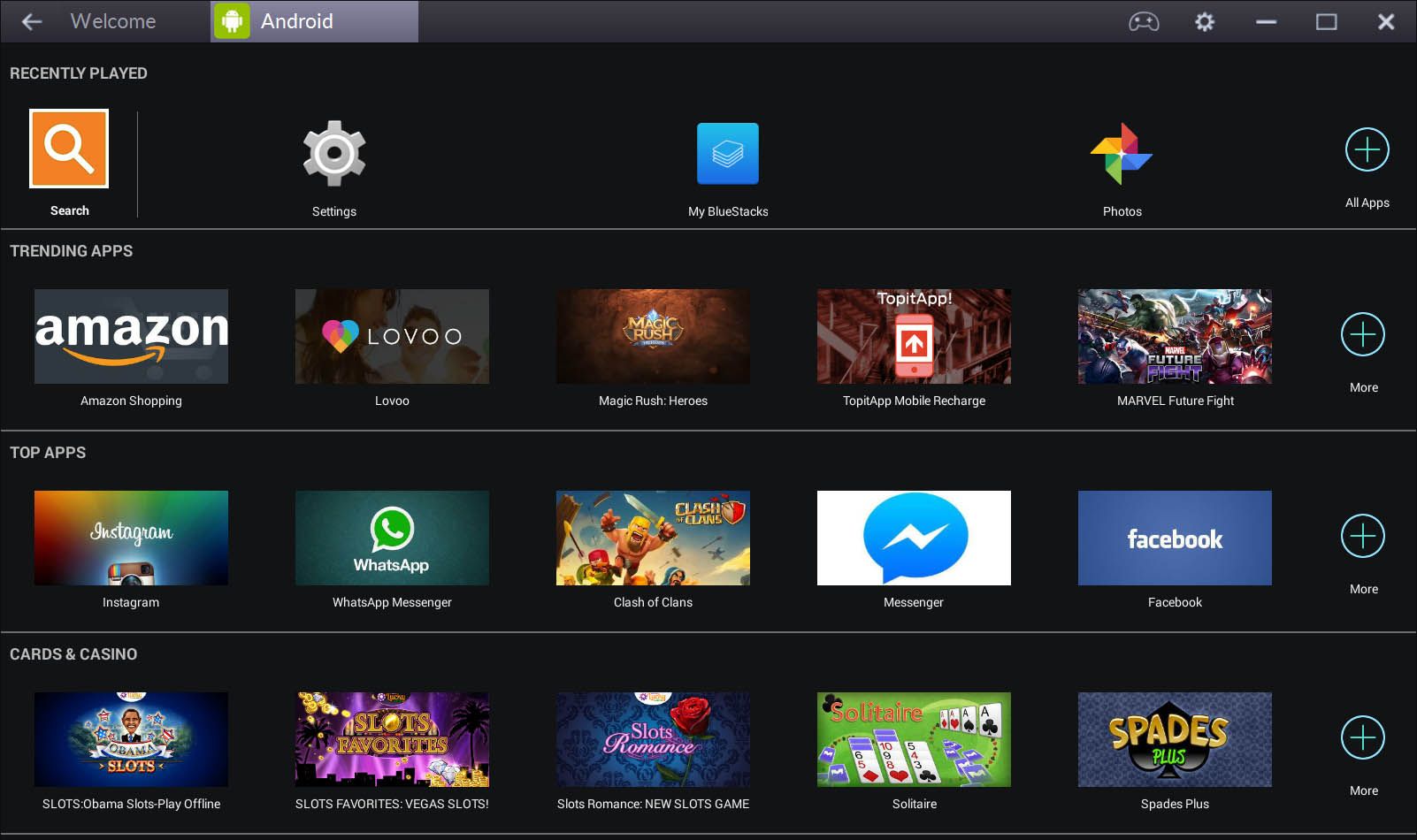
Smoothly running Android apps on Windows has been possible for a while now. A pioneer in that field, in terms of offering an interface adapted to desktop computers rather than just the emulation itself, has been BlueStacks. Just this week the new BlueStacks 2.0 was released with an important new feature: it can run several apps simultaneously over a new tabbed interface.
The new layout is much more compact and functional, resolving an issue some of BlueStack’s equally respectable competitors (like Andy or MEmu) had sorted out a while ago – though they’ll now fall to a back burner again thanks to BlueStack’s full integration with Windows. It’s easiest to understand the impact of this change with an example: if you run the Instagram app in BlueStacks and go to upload a photo, it will give you an option to select one from your hard drive with the Windows file explorer. Seriously crazy stuff.

The multiple tabs don’t simply freeze in the background: if for example you’re playing music or a video, it will keep playing even if you’re in a different tab. Best of all, the system is smooth as silk, even if you’re running it on skimpy hardware. In fact, on the official website they note that 2GB of RAM is more than enough to run the tool properly.

The menus have been reorganized, and now you have a handy sidebar with shortcuts to the most common features: rotating the virtual Android, for instance, or managing the clipboard or opening an APK file to install apps. Also, the back button has been amped up alongside the tabs so you can browse more smoothly. In other words, none of this emulating the Android touch buttons. Everything is much more natural now and removed from emulation/simulation itself.
More information | Official BlueStacks blog


Awsome thanks alot for this wonderful news.
This is the biggest update I think !
Great Update from BlueStacks !