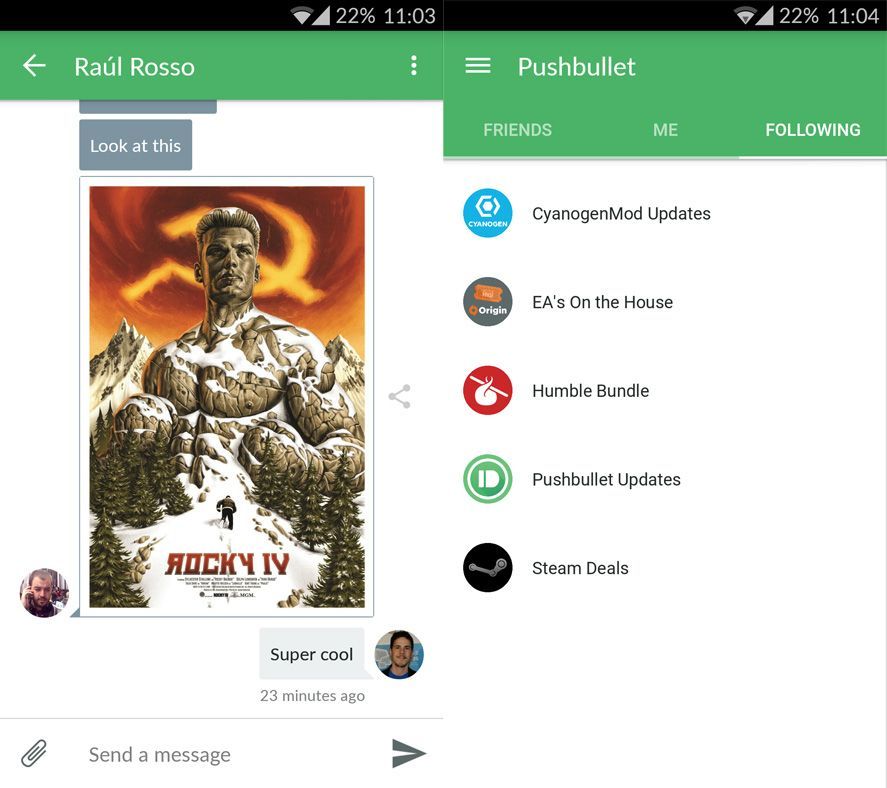
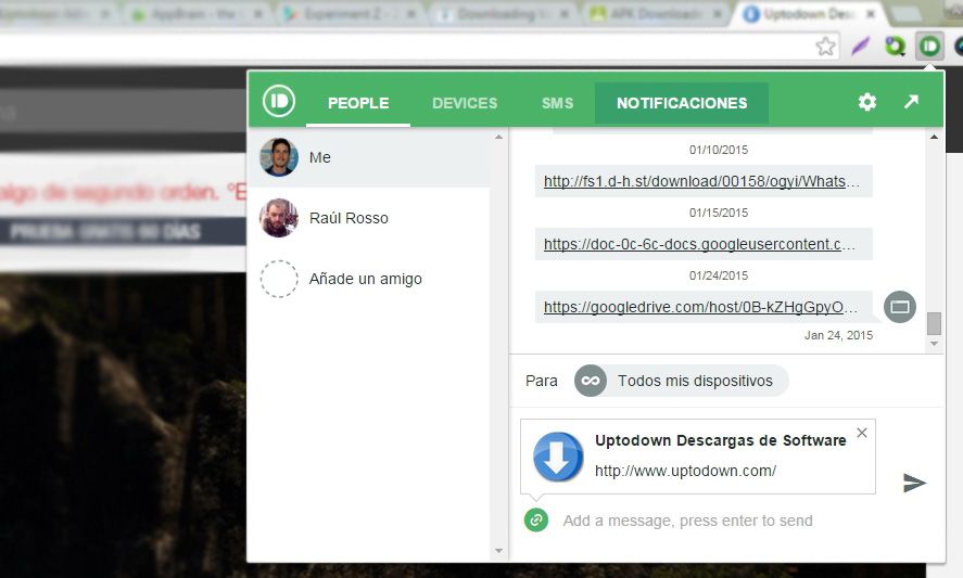
We’ve already hyped Pushbullet here lots of times as a useful service to send information between PCs and mobile devices, with its biggest appeal being its extreme ease of use. Now the program has just received a huge update that completely revamps the look of all its clients and adds long-awaited features that turn the tool into a fabulous freestanding IM service, even though that’s not its principal purpose.
The Android and iOS clients have received the inevitable Material Design facelift (if we had a nickel for every time we mentioned that phrase…) and also seen their sections reorganized. Now everything is divided into three tabs: Friends, where you’ll see a list of all the items sent to other people organized like you’d see in a chat app. In fact, now in addition to sending items it’s possible to sent text instantly on a timeline, meaning it’s completely feasible to have entire conversations in real time. In Me you’ll have the full history of exchanges between your devices, while in Following you’ll have a feed of all the channels you follow.

In terms of the rest of the family, the official browser extension also looks much better and uses the new layout from the mobile platforms, including the chat windows and sent items for each contact. The same goes for the standalone desktop client, which has been enormously improved thanks to the bubbles with the profile picture of your contact and the timeline you can orient on any part of the desktop and that displays floating tabs. The web client has also undergone some improvements, though they are mainly aesthetic.

While Pushbullet was already one of those services that becomes essential on your devices as soon as you tried it, with these latest upgrades its new level of versatility – remarkably – makes it even more awesome.


