Although the ways to follow posts have changed over the years, news readers have stuck around. And Feedly is still one of the main references since Google Reader closed down a while back. Today, it’s still getting new updates like the latest redesign of the official client that’s added a browsing bar at the bottom of the screen. In fact, it’s so different for may users, that the company has decided to release a classic version that maintains the previous structure.

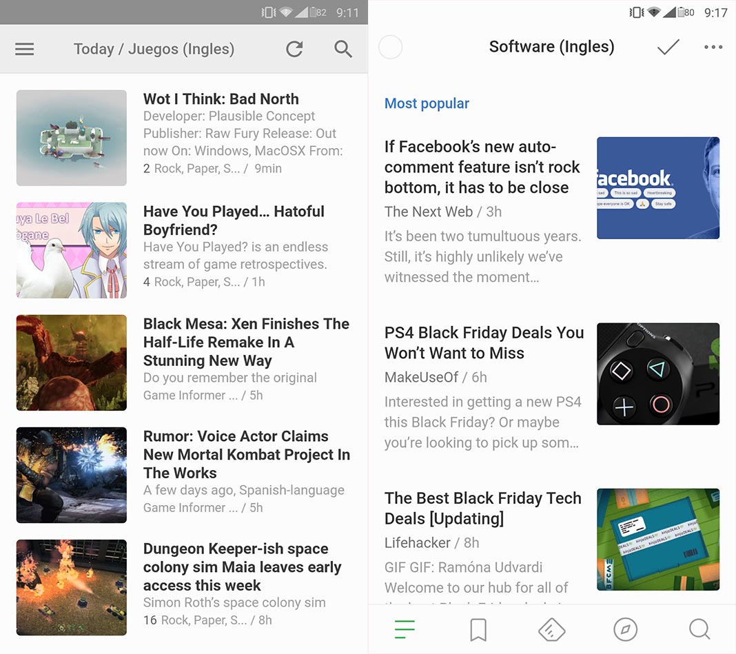
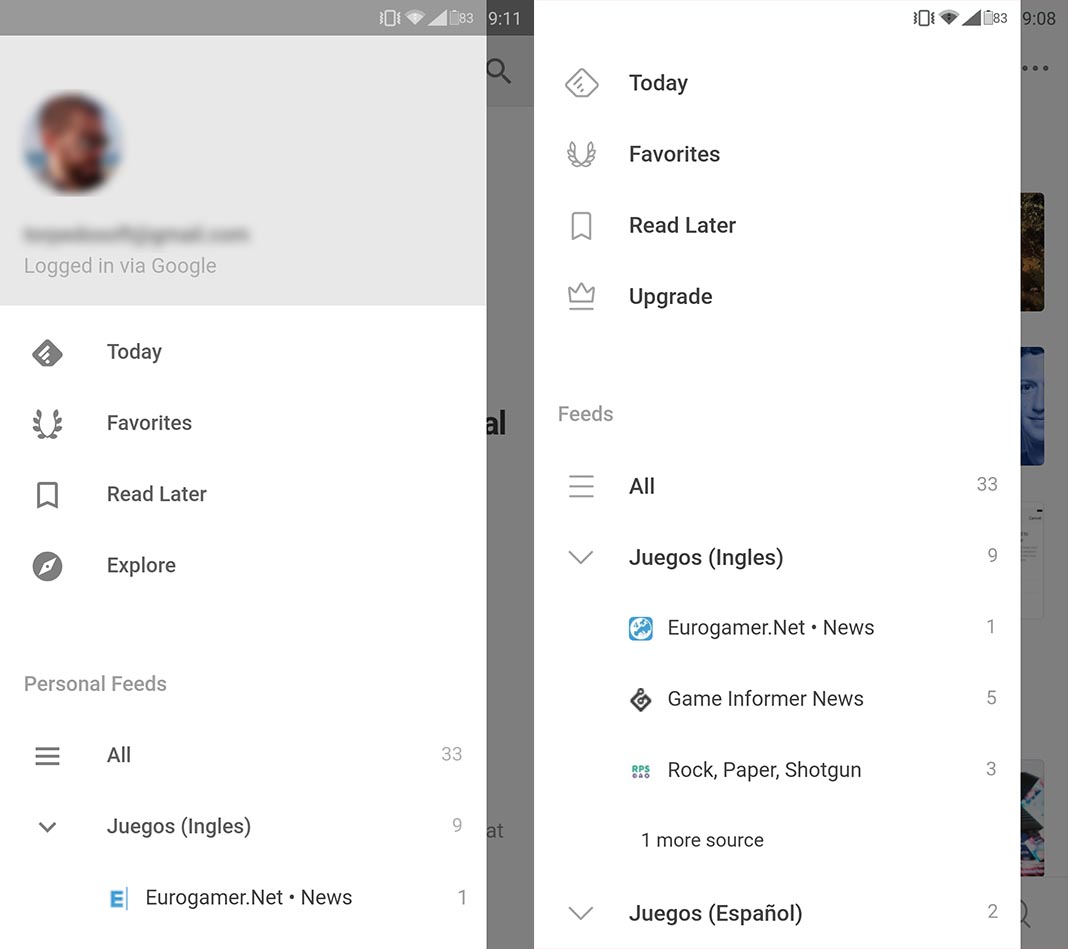
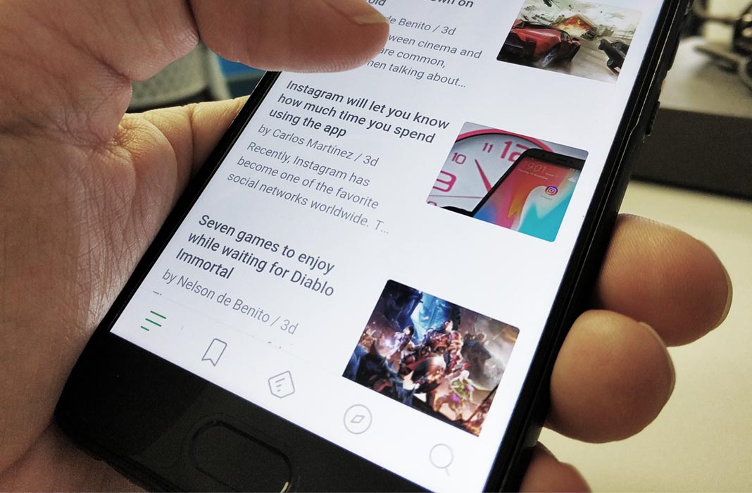
The new Feedly, although it’s still considered a beta version, can already be downloaded via APK without any geographic restrictions, even if you’re not subscribed to the service. What you’ll find is an appearance with simpler lines, and its main allure being the lower icon bar that changes the way you open the side menu. In fact, they’ve gotten rid of the side swipe gesture to open the menu, which is why the app seems so much different.

On the new bar, you also have a button to open the lateral bar, shortcuts to saved texts, the search option, and the Discover section to find new content. Everything else is exactly as it was before, with a few minor changes like the ever-popular dark theme that you can enable from the settings menu.

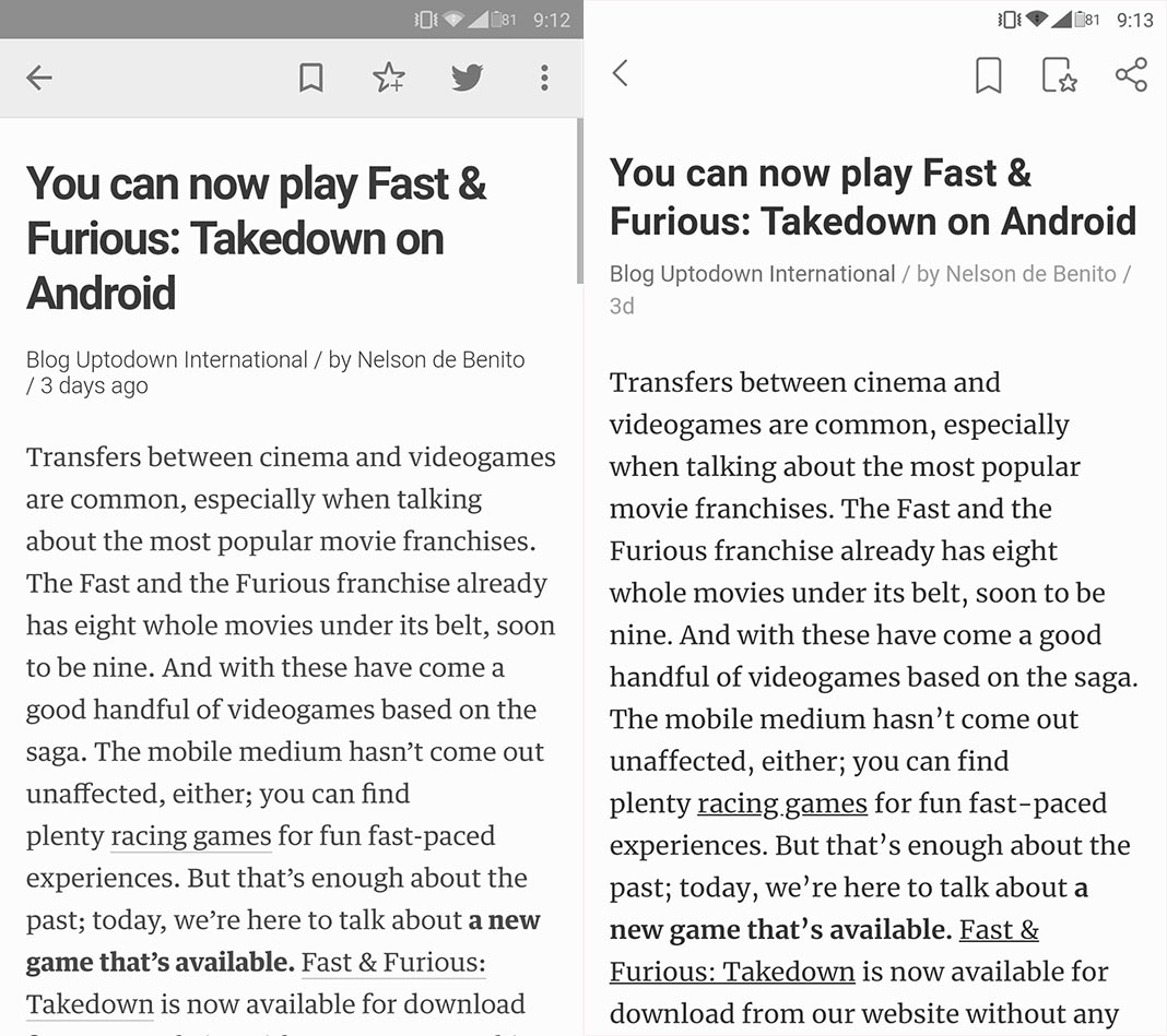
The screenshots seen here show the new design (on the right) and the classic version (on the left) that maintains the same interface, exactly the same as always. Both apps have completely different package names, so they can easily exist on the same device without any conflict. But of course, if you have one, then the other isn’t really necessary at all.

As always, it’s always nice to have alternatives. Beyond the Feedly ecosystem, there are compatible alternatives that are clearly similar like Palabre, Newsfold and Paperboy.


![The top 10 Android apps of the month [November 2018]](https://blog.en.uptodown.com/files/2018/11/feedly-new-feat-218x150.jpg)


Very nice design and style and superb articles, hardly anything else we need
:D.