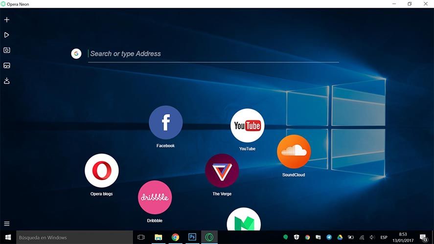
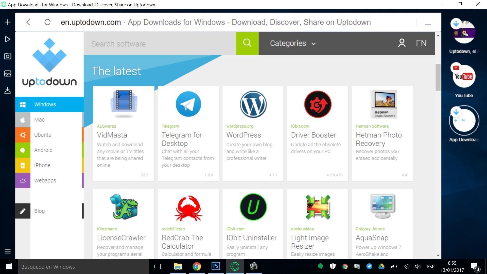
The experience on desktop devices and smartphones has been getting ever more unified for a while now. Opera is conscious of this, which is why it’s just released Opera Neon, a sort of experiment that tries to run in parallel the different versions of Opera’s main browser. It offers a natural gesture control system designed for use on touchscreens for systems running Windows 10.

It can be complicated to evolve an interface so ingrained and internalized as a desktop browser, but there’s obviously still a lot of room for maneuver. In this case Neon has its own desktop within the client that displays URLs in bubbles you can move as desired and which serve as something like bookmarks. In fact, instead of tabs you’ll see bubbles that stack up when you open several of them at a time.
The controls are perfectly usable with your mouse, but they were designed for use on touchscreens, as there are ever more hybrid laptops and tablets running Windows 10, which is why this experiment makes so much sense. And do note the word experiment, as that’s precisely what this project is: Opera has made clear quickly that Opera Neon is a conceptual trial that won’t be continued or launched on other platforms – it’s just to test out possible improvements and changes to the normal Opera.

The integrated features you can access from the left panel include a few curiosities: a media player, or at least that’s what the thing does (it’s actually just a section of the browser where you can place URLs to play audio in the background). Plus Opera Neon has its own screenshot tool, or even crop a specific part of the page you’re looking at.
Opera Neon for Windows | Download


[…] – it’s now “Opera Reborn” – and brings together everything learned with its Neon experiment to offer a full revamp, complete with useful features like integration with WhatsApp and Facebook […]