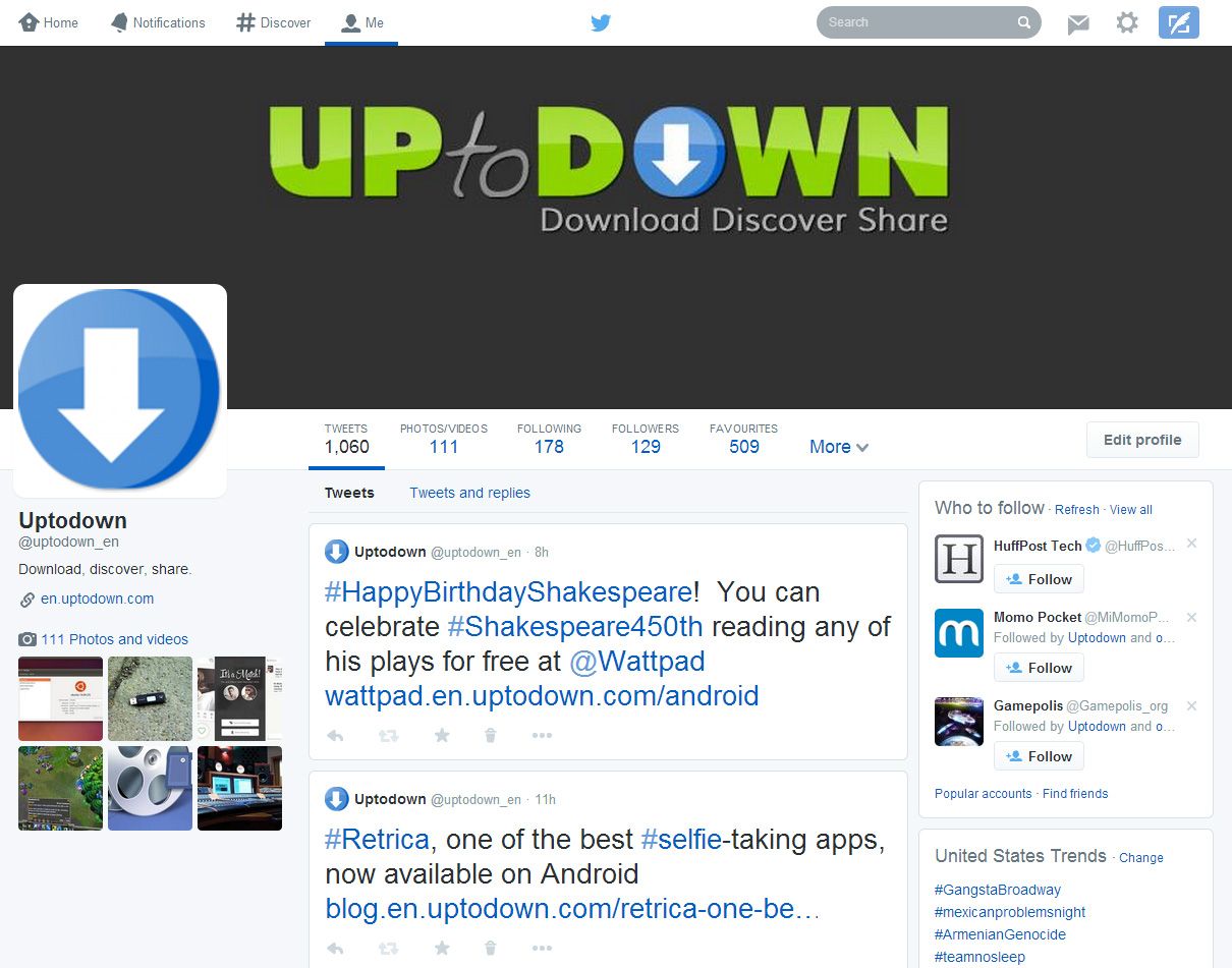
The new Twitter design was launched a few weeks ago but it was only on Tuesday that it began to be fully rolled out to to all users. Now, if you log onto your profile you’ll get a message inviting you to try the new design and definitively apply it to your account. Here we explain how to use the new features and customize its look.
The new header image
The new header image is the heart of your wall, and will adapt to whatever screen size you’re using, making it, for all intents and purposes, your cover letter. Although it’s possible to upload any image and resize it as desired, the ideal is for it to be sized 1500×500 so that it looks clear even on high-res screens. The responsive design will ensure it looks good at any screen width.

With regards to the profile pic, the new recommended size is 400×400, meaning that in most cases you’ll need to replace the one that’s already there, not to mention the complete shakeup in the layout, which will probably oblige you to re-jig how your profile and header images fit together. In both cases, you can change the images at any time using the “Edit Profile” button in the right column.
How to pin tweets to your header
Your posts will now have a different style depending on their repercussions among other users, so if one receives enough mentions or retweets or if it’s your latest post, it will have a different format with a larger-size font to emphasize its importance.
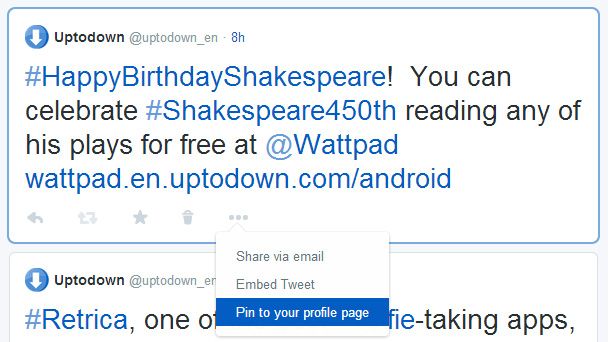
Nevertheless, like what happens in forums, it’s possible to pin a tweet so it appears at the head of your timeline as a sort of introduction or sample of your tweeting. To pin a tweet you just have to drop-down the menu to the right of the favorite and retweet buttons for the selected tweet, then click “Pin to your profile page”. This same drop-down menu also has options to send that message by email or copy the embed code to insert into a blog post, for example.
Other details
We’ve already mentioned the rest of the novelties on this new homepage. One of the most interesting is that messages with attached images have been given greater emphasis. Now the image URL will no longer appear in the tweet itself, meaning the URL + image combo is much more tolerable (however, this feature is still not included in the main timeline). Also, from the right column you can now access your list of tweets that include videos and images in a much more practical way, with the slideshow used until now giving way to a simple filter.
Another welcome filter is the one that lets you view a user’s profile in two different ways: you can view all tweets or filter out the direct responses to other people. Both options (Tweets or Tweets and Replies) are found right next to the list of tweets.


