We often gauge the quality of an app by its number of downloads, but in many cases that’s not the best of measures. CM Launcher is the most popular customization layer on the market, boasting more than 100 million total downloads. The surprising thing about this is that the success has come in spite of the app being a hotbed of bloatware, annoying widgets, and ads all over the place.

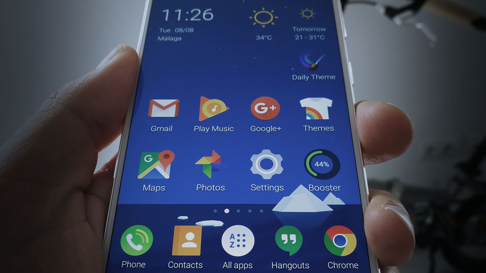
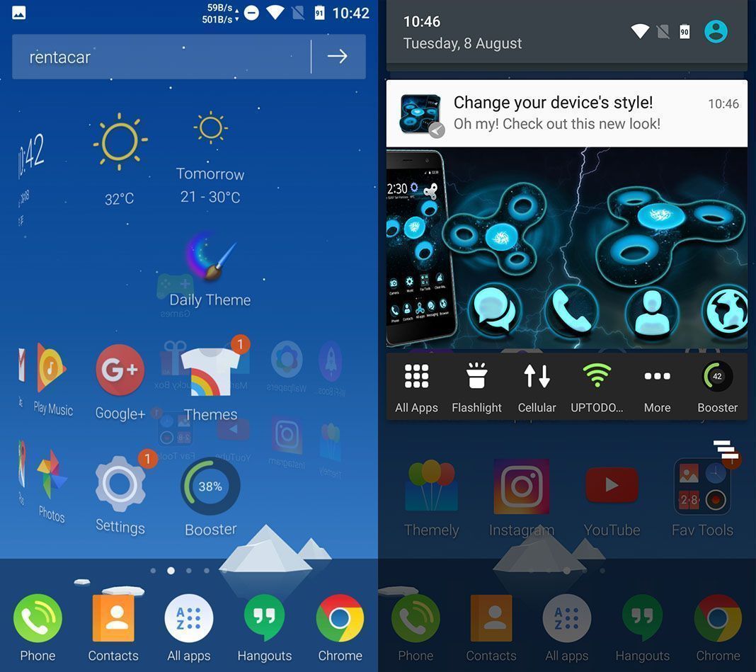
Once it’s installed, and after the inoffensive bit where you pick your default wallpaper, the walk of horrors begins. The home screen on your device gets transformed and jammed with hitherto-unseen icons that even make it hard to find things you already had installed. On the five new desktop screens I count a total of no less than 22 new icons, including new installed programs, shortcuts to downloads for third-party apps, and convoluted shortcuts to features that already existed on the operating system.

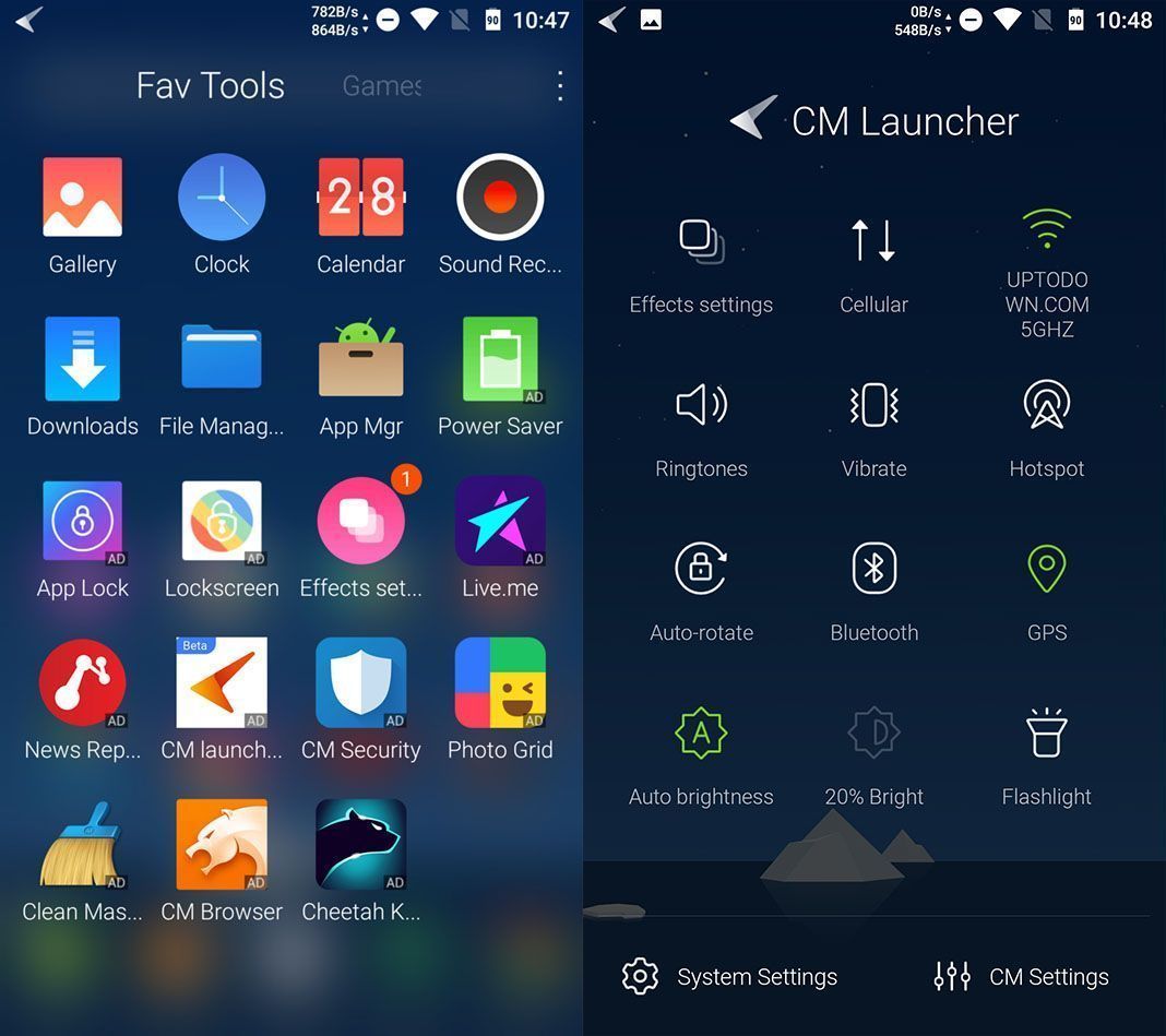
It seems that it also integrates a “booster” system to free up RAM and increase the battery life, though its usefulness is highly questionable. Besides this feature having its own dynamic icon at the start, when you swipe left it opens up straightaway and stays running in the background. The other item that appears within seconds as if by magic is a new bar full of shortcuts alongside your notifications, and is completely redundant given that it shows practically all the same stuff.
But that’s not the only thing that’s been fiddled with. The App Drawer now displays ads everywhere (seriously!), and the settings menu takes you to an intermediary menu with another shortcut to the actual control panel on Android. Not content to stop there, the default search widget has been replaced and if you don’t tread carefully, you can easily mix it up with the new shortcut to a marketplace with an icon suspiciously similar to the one for Google Play.

But okay – it’s not all negative. The system of 3D transitions between screens is clearly its greatest appeal, not to mention the elegant transparencies superimposed over the wallpaper, the smart layout of your installed apps into themed categories, and the depth of the options to customize the interface with animations or aesthetic changes. All good ideas that suffer from all the annoyances mentioned above. In fact, we’ve tried to get rid of the irrelevant content, but some of the elements (like the themes manager, the custom search bar, and the “bridge” submenu to the settings) are impossible to get rid of.
In light of all this, if what you’re looking for is an elegant and pretty launcher, there are a ton of alternatives that aren’t so aggressively monetized. Apps like Nova Launcher and Arrow Launcher from Microsoft are good choices. Still, if CM Launcher excites you with its 3D transitions you can always buy the Pro version to get rid of the ads. Maybe the idea is that people who use the free one end up so exasperated that they have no option but to buy the full version.


