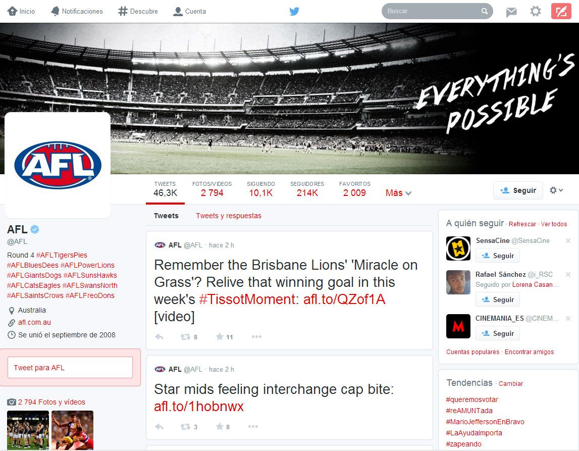
Twitter has just announced a redesign on its official blog. As of today the new design will start to be rolled out for the web client of the popular social network with deep changes unlike anything seen since its birth: a new profile page with much more information, the ability to pin your tweets and a different format for messages that have wider effects are some of the many improvements.
Now you can view the design on several famous accounts, from the one and only Michelle Obama to actor Channing Tatum, although as of several days ago many users have already been able to use it during its test phase. While the timeline of the rollout to all users has not yet been specified, it will gradually arrive to everybody.

The first big change is a much larger customized header that includes a featured image and your profile photo, with your description in the left column alongside a filter to view tweets with attached images or videos, and most importantly, a field to tweet to that user as if in a direct message.
The timeline is also different. Besides a new box to highlight the tweet your mouse is hovering over, some tweets will appear in a much larger font to make them stand out based on the number of replies, favorites, and RTs it has received. As if all that weren’t enough (and in a way similar to the system used in forums), you can also now pin one of your tweets to the top of your timeline.
Whether all these changes are a good or bad decision lies in the hands of the users themselves. One of the identifying features of Twitter is its minimalism when it comes to browsing the service, an aspect that now only smartphone users will keep, although from what we’ve seen so far, they probably won’t be able to escape this wave of changes.


