If we had a nickel for every time someone said ‘Material Design’ we’d be millionaires by now. But it’s true that the aesthetic revamp to the Android ecosystem is breathing new life into lots of acclaimed apps. The new version of the Feedly news reader has gotten on the Material Design wagon, with its version 36 modifying the interface to make it into the best (by a mile) RSS reader for Android now available.
As was mentioned a few weeks ago, the app redesign follows the visual standards of Android Lollipop with regards to font, spacing, and browsing cards. Translation for non-geeks: Feedly is now better-looking, clearer, and more intuitive.

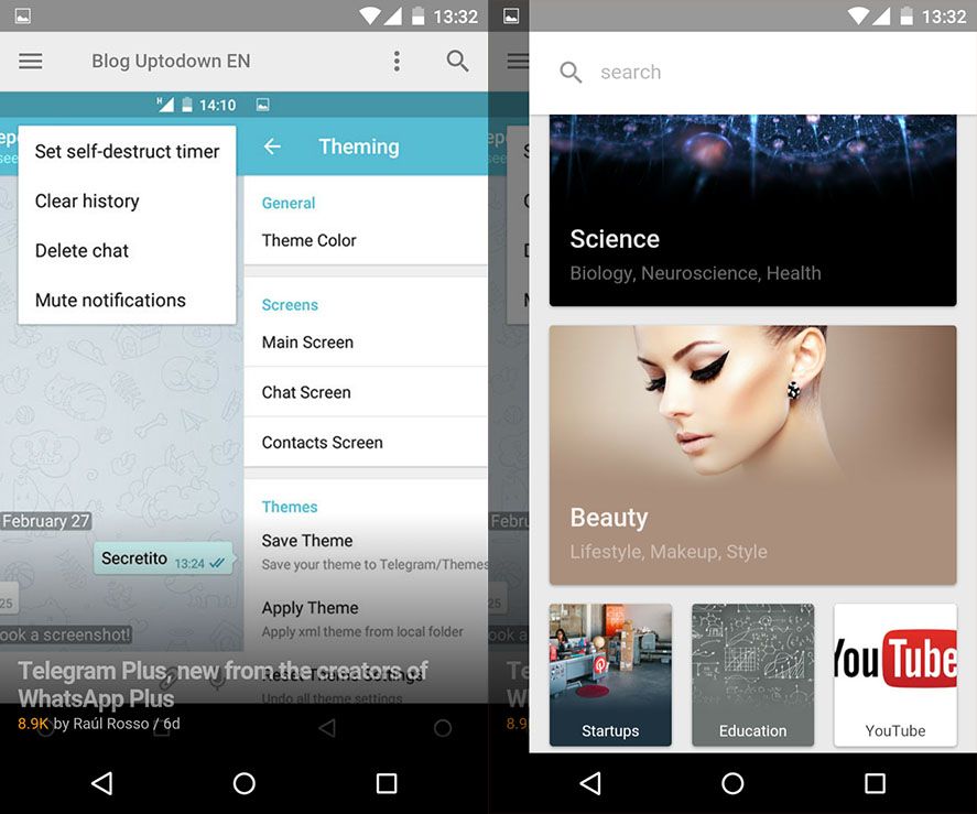
The layout is practically the same as before, although the design has been evened out across the board, from the transitions to the preview images for each article, to the point that in most cases it’s even easier to read an article on the RSS reader itself than on the original page.
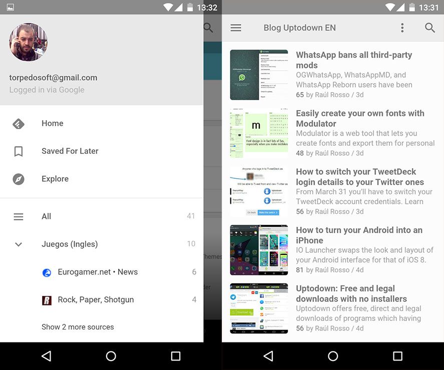
Category browsing is now much friendlier, and the layout has been considerably improved to adapt to the screen resolution, meaning whether you’re on a phone or a tablet, reading your unread articles is more fluid and manageable—which is exactly the key to good design: making a page better without users noticing exactly which changes have been made. For those of you who are curious, a few weeks ago Medium ran a piece where Arthur Bodelec, designer of the tool and co-founder of Feedly, explains the revamp process.